
Page 65 - bfw-APHG-1e
P. 65
Cumulative FRQ
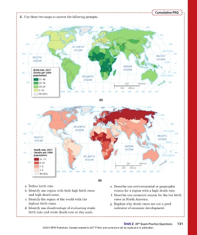
3. Use these two maps to answer the following prompts.
80°N 80°N
Arctic Circle
Arctic Circle
60°N 60°N
40°N 40°N
ATLANTIC
OCEAN Tropic of Cancer
Tropic of Cancer
20°N 20°N
PACIFIC PACIFIC
OCEAN OCEAN
Equator
0° Equator 0°
INDIAN
Birth rate, 2017 OCEAN
20°S (births per 1000 20°S
population) ATLANTIC Tropic of Capricorn
Tropic of Capricorn
37–48 OCEAN
40°S 25–36 0 2000 4000 miles 40°S
13–24 0 2000 4000 km
0–12 140°W 120°W 100°W 80°W 60°W 40°W 20°W 0° 20°E 40°E 60°E 80°E 100°E 120°E 140°E 160°E 180°
120°W
160°W
160°W
140°W
100°W
No data
(A)
80°N 80°N
Arctic Circle
Arctic Circle
60°N 60°N
40°N 40°N
ATLANTIC
OCEAN Tropic of Cancer
Tropic of Cancer
20°N 20°N
PACIFIC PACIFIC
OCEAN OCEAN
Equator
0° Equator 0°
INDIAN
Death rate, 2017 OCEAN
(deaths per 1000
Neuman chg2e first pass NOTES 5/21/2018, revised 6/16/2018: 20°S
20°S
population) ATLANTIC Tropic of Capricorn
Tropic of Capricorn
11–15
OCEAN
1. Remake on project’s standard Robinson 10E base; 43p6 wide. Converted to floating world map on 6/16/2018.
40°S 9–10 0 2000 4000 miles 40°S
7–8
2. Updated to 2017 data from PRB: 0 2000 4000 km
1–6
http://www.worldpopdata.org/table 100°W120°W140°W160°W 140°W 120°W 80°W 60°W 40°W 20°W 0° 20°E 40°E 60°E 80°E 100°E 120°E 140°E 160°E 180°
160°W
No data
select indicator: population dynamics > births per 1000 population
select geography: countries > select all countries
(B)
I changed data breakdowns from 0-13 / 14-21 / 22-31 / 32-52 since the highest value in the 2017 data is 48, not 52. They had apparently
a. Define birth rate.
e. Describe one environmental or geographic
just divided the old 0--52 data range numerically into four equal chunks, so I did the same with the new 0--48 data range. (This is NOT
b. Identify one region with both high birth rates
reason for a region with a high death rate.
the same as dividing all of the countries into four equal chunks and then seeing where the data breaks would occur as a result).
and high death rates. f. Describe one economic reason for the low birth
c. Identify the region of the world with the
rates in North America.
3. Changed colors to greens; author commented on 3.5 that he didn’t want 3.3 and 3.5 using the same progressions of purple.
highest birth rates. g. Explain why death rates are not a good
d. Identify one disadvantage of evaluating crude indicator of economic development.
birth rate and crude death rate at this scale.
Unit 2 AP® Exam Practice Questions 131
©2021 BFW Publishers. Sample material is NOT FINAL and corrections will be made prior to publication.
02_Hildebrhgap1e_19224_unit02_002_131_4pp.indd 131 05/19/20 6:08 PM