
Page 124 - 2023-bfw-stacy-2e-proofs-SE
P. 124
130 PERIOD 2 Colonial America amid Global Change: 1607–1754
(continued)
by indentured servants. Here, your knowledge of the history is very important,
These sample pages are distributed by Bedford, Freeman & Worth Publishers.
because you might choose this option without that knowledge. Even if you were
unsure about whether indentured servants left the colonies, you could reason
that option A is probably not correct because the overall trend during this time
was that colonies’ populations were growing, making this option unlikely.
Copyright (c) 2024 Bedford, Freeman & Worth Publishers.
Option B is incorrect because it misreads the graph. While there was a point
when indentured and enslaved labor reached parity, this option says “throughout
the period,” and therefore, this option can’t be correct.
Strictly for use with its products. NOT FOR REDISTRIBUTION.
Option C is incorrect, because while the information it contains is generally true,
it does not relate to a “development,” which is a key part of the question. Specifically,
option C is a good example of an answer that is factual but not correct. These kinds of
wrong answers often appear in multiple-choice questions. If you narrowed down your
choices to C and D because both are true, ask yourself which one can be proven by the
graph. If you do that, you will notice that the graph contains no information about
who the indentured or enslaved were.
Option D is the correct answer because it reflects the developments seen in the
graph. Literally, there are two lines in the graph. The red line shows a decreasing
number of indentured servants over time, while the blue line shows the increase
in numbers of enslaved people during the same period. With an accurate under-
standing of the graph along with an application of your historical knowledge, you
should be able to identify this as the correct response.
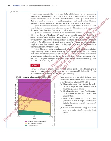
ACTIVITY
Now, try to answer a stimulus-based multiple-choice question on a different graph
from earlier in the module. Use the same thought process modeled above. Feel free to
review the content earlier in the module if you need help.
Wealth Inequality in Northern Cities, 1690–1775 1. Based on the graph, which of the following best
100 accounts for developments in wealth inequality
in northern cities between 1690–1775:
90 (A) Planters increasingly controlled the trade
Share of total taxable wealth (percentage) 60 (B) Merchants increasingly profited from the
80
of cash crops between British North
America and Great Britain.
70
trade between British North America and
Great Britain.
50
(C) Middle-class consumers increasingly
purchased more luxury goods from Great
40
Britain than the poorest 60 percent of
30
consumers.
20
crops in colonial cities for export to Great
10 Data from Gary B. Nash, The Urban Crucible: Social Change, Political Consciousness, and the Origins of the American Revolution (Cambridge, MA: Harvard University Press, 1979). (D) Yeoman farmers increasingly sold their
Britain.
1690 1730 1775
Year
Wealthiest 10 percent of residents
Next wealthiest 30 percent
Poorest 60 percent
HEW_9462_04_F01 Wealth Inequality in Northern Cities
First proof
03_foan2e_48442_period2_052_143.indd 130 06/09/23 11:10 PM