
Page 31 - 2023-bfw-TLC-4e
P. 31
2
from the text of the ad, PETA equates allowing children to eat meat with child abuse
/
because, according to them, both carry health risks. But is this a fair comparison? Or is it
a faulty analogy that focuses on irrelevant or inconsequential similarities between two
things? Just because two things are alike in one or more respects doesn’t mean they are
Argument
necessarily alike in every respect.
Because the purpose of this ad is to make an impact quickly and emotionally, it doesn’t
bother to explain the analogy or prove a link between eating meat and being fat — or that
either of those two things is an actual threat to a person’s health. Another logical problem
in this ad is the either-or fallacy. There is a large space between eating meat and abuse,
which we associate with exploitation and harm. Allowing your child to sometimes eat meat
and abusing your child are not the only parenting choices available! Furthermore, the lack
of detail about the type or amount of meat needed to cause significant weight gain points
to another fallacy: hasty generalization. In this type of fallacy, there’s not enough evidence
to support a given conclusion. Often, these fallacies use a few instances of a phenomenon
as the basis for much broader conclusions.
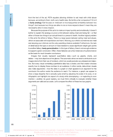
Images that visually represent quantitative data — such as graphs, charts, and
tables — may look objective at first glance. The automatic ethos we tend to attribute to such
images stems from their use of numbers, which we usually perceive as unbiased and objec-
tive. But every visual containing quantitative data has a creator, and that creator chooses
exactly how to display those numbers to an audience. In other words, data-driven visuals
also make arguments — how the data in a graph or chart appears is an argument for the
conclusion the author wants the audience to reach. For instance, a graph can appear to
show a large disparity that is actually quite small by adjusting the scale of its axes, or an
infographic can highlight one aspect of a study while downplaying — or neglecting to even
mention — another. As good readers, we must think critically to evaluate whether these
arguments are valid and accurate. Let’s compare the effect of these two bar graphs:
3.154 3.50
3.152 3.00
Interest Rates (in percent) 3.148 Interest Rates (in percent) 2.00
3.150
2.50
1.50
3.146
3.144
3.142 1.00
0.50
3.140 0.00
2008 2009 2010 2011 2012 2008 2009 2010 2011 2012
88
Uncorrected proofs have been used in this sample. Copyright © Bedford, Freeman & Worth Publishers.
Distributed by Bedford, Freeman & Worth Publishers.
For review purposes only. Not for redistribution.
03_sheatlc4e_40925_ch02_058_111_4pp.indd 88 8/9/22 2:54 PM