
Page 32 - 2023-bfw-TLC-4e
P. 32
The interest rates on the graph on the right begin at 0.00 percent, as most readers
would anticipate, and go up to 3.50 percent, meaning the y-axis shows a span of
3.50 percent. Alternately, the interest rates on the graph on the left begin at 3.140 per-
cent and then go up to 3.154 percent, which means the y-axis only shows a span of Analyzing Visual Texts
0.14 percent. Both graphs present the same information, yet a quick glance at the
graph on the left would lead a reader to draw the conclusion that interest rates have
increased steeply, while the graph on the right would lead one to conclude that inter-
est rates have barely changed at all. As our world comes to rely more heavily on data, /
we need to be aware of the ways in which our readings of that data may be misled
based on its visual presentation.
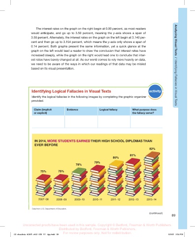
Identifying Logical Fallacies in Visual Texts activity Identifying Fallacies in Visual Texts
Identify the logical fallacies in the following images by completing the graphic organizer
provided.
Claim (implicit Evidence Logical fallacy What purpose does
or explicit) the fallacy serve?
IN 2014, MORE STUDENTS EARNED THEIR HIGH SCHOOL DIPLOMAS THAN
EVER BEFORE
82%
81%
80%
79%
78%
75% 75% 75% 75% 75%
2007–08 2008–09 2009–10 2010–11 2011–12 2012–13 2013–14
Data from U.S. Department of Education.
(continued )
89
Uncorrected proofs have been used in this sample. Copyright © Bedford, Freeman & Worth Publishers.
Distributed by Bedford, Freeman & Worth Publishers.
For review purposes only. Not for redistribution.
03_sheatlc4e_40925_ch02_058_111_4pp.indd 89 8/9/22 2:54 PM