
Page 33 - Demo
P. 33
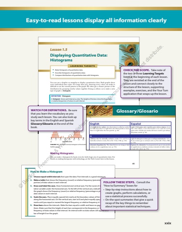
xxix Easy-to-read lessons display all information clearly 45L E A R N I N G TA R G E T S %u2022 Make histograms of quantitative data. %u2022 Describe histograms of quantitative data. %u2022 Compare distributions of quantitative data with histograms. Lesson 1.5 Displaying Quantitative Data: Histograms You can use a dotplot or stemplot to display quantitative data. Both graphs show every individual data value. For large data sets, showing every value can make it difficult to see the overall pattern in the graph. We often get a cleaner picture of the distribution by grouping nearby values together. Doing so allows us to make a new type of graph: a histogram. DEFINITION Histogram A histogram shows each interval as a bar. The heights of the bars show the frequencies or relative frequencies of values in each interval. Figure 1.6 shows a dotplot and a histogram of the durations (in minutes) of 263 eruptions of the Old Faithful geyser. Notice how the histogram groups nearby values FIGURE 1.6 (a) Dotplot and (b) histogram of the duration (in minutes) of 263 eruptions of the Old Faithful geyser. 1.5 2.0 2.5 3.0 3.5 4.0 4.5 5.0Duration (min)1.5051015202530354045502.0 2.5 3.0 3.5 4.0 4.5 5.0Duration (min)Frequency Making Histograms You can make a histogram by hand, even for fairly large sets of quantitative data. For details on making histograms with technology, see the Tech Corner later in this lesson. (a) (b)46 Chapter 1 %u2022 Analyzing One-Variable DataHow to Make a Histogram1. Choose equal-width intervals that span the data. Five intervals is a good minimum.2. Make a table that shows the frequency (count) or relative frequency (percentage or proportion) of data values in each interval.3. Draw and label the axes. Draw horizontal and vertical axes. Put the name of the quantitative variable under the horizontal axis. To the left of the vertical axis, indicate whether the graph shows the frequency (count) or relative frequency (percentage or proportion) of data values in each interval.4. Scale the axes. Place equally spaced tick marks at the boundary values of the intervals along the horizontal axis. On the vertical axis, start at 0 and place equally spaced tick marks until you equal or exceed the largest frequency or relative frequency in any interval.5. Draw bars above the intervals. Make the bars equal in width and leave no gaps between them. Make sure that the height of each bar corresponds to the frequency or relative frequency of data values in that interval. An interval with no data values will appear as a bar of height 0 on the graph.It is possible to choose intervals of unequal widths when making a histogram, but such graphs are beyond the scope of this book. CHECK THE SCOPE. Take note of the two or three Learning Targetslisted at the beginning of each lesson. They are revisited at the end of the lesson and connect closely to the structure of the lesson, supporting examples, exercises, and the Your Turn application that wraps-up the lesson. that span the data. Five intervals is a good minimum. that shows the frequency (count) or relative frequency (percentage or pro- Draw horizontal and vertical axes. Put the name of the quantitative variable under the horizontal axis. To the left of the vertical axis, indicate whether the graph shows the frequency (count) or relative frequency (percentage or proportion) of Place equally spaced tick marks at the boundary values of the intervals along the horizontal axis. On the vertical axis, start at 0 and place equally spaced tick marks until you equal or exceed the largest frequency or relative frequency in any interval. above the intervals. Make the bars equal in width and leave no gaps between them. Make sure that the height of each bar corresponds to the frequency or relative frequency of data values in that interval. An interval with no data values will appear as a FOLLOW THESE STEPS. Consult the %u201cHow to/Summary%u201d boxes for %u2022 Step-by-step instructions about how to create graphs, perform calculations, or use a statistical process successfully. %u2022 On-the-spot summaries that give a quick recap of the key things to remember about important statistical techniques. Figure 1.6 shows a dotplot and a histogram of the durations (in minutes) of 263 eruptions of the Old Faithful geyser. Notice how the histogram groups nearby values together into equally wide intervals. WATCH FOR DEFINITIONS. Be sure that you learn the vocabulary as you study each lesson. You can also look up key terms in the English and Spanish Glossary/Glosario at the end of the book. G-1Glossary/GlosarioEnglish Espa%u00f1ol1.5%u00d7 IQRrule for outliers An observation is called an outlier if it falls more than 1.5%u00d7 IQR above the third quartile or more than 1.5%u00d7 IQR below the first quartile. (p. 80)regla 1.5 la %u00d7 gama entre cuartiles para valores at%u00edpicos Se le dice valor at%u00edpico a una observaci%u00f3n si cae a m%u00e1s de 1.5 la %u00d7gama entre cuartiles por encima del tercer cuartil o por debajo del primer cuartil. (p. 80)Aaddition rule for mutually exclusive events If A and B are mutually exclusive events, P P (A%u00a0or%u00a0B) = + (A) ( P B). (p. 341)regla de suma para eventos que se excluyen mutuamente Si A y B son eventos que se excluyen entre s%u00ed, P P (A%u00a0o%u00a0B) ( = + A) P(B). (p. 341)alternative hypothesis Ha The claim that we are trying to find evidence for in a significance test. (p. 576)hip%u00f3tesis Ha alternativa La proposici%u00f3n de que en una prueba de significancia estad%u00edstica estamos tratando de hallar evidencia que est%u00e9 a favor. (p. 576)anonymity The names of individuals participating in a study are not associated with their responses. (p. 314)anonimato Cuando no se asocia los nombres de las personas que participan en un estudio con sus respuestas. (p. 314)approximate sampling distribution The distribution of a statistic in many samples (but not all possible samples) of the same size from the same population. (p. 468)distribuci%u00f3n aproximada del muestreo Distribuci%u00f3n de una estad%u00edstica entre muchas muestras (aunque no entre todas las muestras posibles) del mismo tama%u00f1o de la misma poblaci%u00f3n. (p. 468)association A relationship between two variables in which knowing the value of one variable helps predict the value of the other. If knowing the value of one variable does not help predict the value of the other, there is no association between the variables. (p. 171)asociaci%u00f3n Relaci%u00f3n entre dos variables en la cual saber el valor de una variable facilita la predicci%u00f3n del valor de la otra. Si saber el valor de una variable no facilita la predicci%u00f3n del valor de la otra, entonces no existe ninguna asociaci%u00f3n entre las variables. (p. 171)Bbar chart A graph that shows the distribution of a categorical variable such that each category is a bar. The heights of the bars show the category frequencies or relative frequencies. (p. 13)gr%u00e1fica de barras Gr%u00e1fica que muestra la distribuci%u00f3n de una variable categorizada de tal manera que cada categor%u00eda es una barra. La altura de las barras muestra las frecuencias de las categor%u00edas o las frecuencias relativas. (p. 13)bias The design of a statistical study shows bias if it is very likely to underestimate or very likely to overestimate the value you want to know. (p. 260)sesgo El dise%u00f1o de un estudio estad%u00edstico refleja un sesgo si existe una alta probabilidad de subestimar o sobreestimar el valor que se busca. (p. 260)biased estimator A statistic used to estimate a parameter is biased if the mean of its sampling distribution is not equal to the true value of the parameter being estimated. (p. 475)calculador sesgado La estad%u00edstica que se usa para computar un par%u00e1metro est%u00e1 sesgada si la media de la distribuci%u00f3n de su muestreo no equivale al valor real del par%u00e1metro que se est%u00e1 computando. (p. 475)bimodal A graph of quantitative data with two clear peaks. (p. 28)bimodal Gr%u00e1fica de datos cuantitativos con dos picos bien definidos. (p. 28)binomial distribution The probability distribution of a binomial random variable, which is completely specified by two numbers: the number of trials n of the chance process and the probability of success p on each trial. (p. 433)distribuci%u00f3n binomial La distribuci%u00f3n de probabilidad de una variable aleatoria binomial, que se especifica por completo con dos n%u00fameros: la cantidad de ensayos n del proceso aleatorio y la probabilidad de un acierto p en cada ensayo. (p. 433)binomial probability formula If X is a binomial random variable with n trials and probability p of success on each trial, the probability of getting exactly r successes in n trials (for r n = 0,1,2,..., ) is = = %u2212 %u2212 P X r Cn r p p r n r ( ) ( ) (1 ) . (p. 432)f%u00f3rmula de probabilidad binomial Si X es una variable aleatoria binomial con n ensayos y la probabilidad p de acierto en cada ensayo, la probabilidad de obtener exactamente r aciertos en n ensayos (para r n = 0,1,2,..., ) es = = %u2212 %u2212 P X r Cn r p p r n r ( ) ( ) (1 ) . (p. 432)%u00a9 Bedford, Freeman & Worth Publishers. For review purposes only. Do not distribute.
