
Page 34 - 2022-bfw-morris-1e
P. 34
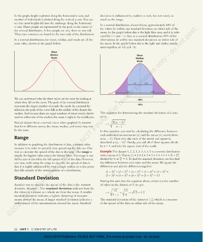
In the graph, height is plotted along the horizontal x-axis, and   deviation is influenced by outliers as well, but not nearly as
                 number of individuals is plotted along the vertical y-axis. You can   much as the range.
                 see that most heights fall into the midrange along the horizontal   In a normal distribution, shown below, approximately 68% of
             ©2022 BFW Publishers. PAGES NOT FINAL. For review purposes only - do not post.
                 x-axis. These people are represented by the peak in the center of   the values lie within one standard deviation on either side of the
                 the normal distribution. A few people are very short or very tall.   mean. In the graph below, this is the light blue area, and it is indi-
                 These two extremes are found on the two ends of the distribution.
                                                                        cated by +1s and -1s. Also in a normal distribution, 95% of the
                 In a normal distribution, the mean, median, and mode are all the   observations lie within two standard deviations on either side of
                 same value, shown in the graph below.                  the mean. In the graph below, this is the light and darker purple
                                                                        areas together, or +2s and -2s.
                                         Mean
                                        Median                                                  Mean
                                         Mode                                                   Median
                                                                                                Mode


                                                                                              –1s    +1s

                                                                                         –2s             +2s

                 We can understand why the three values are the same by looking at               68%
                 where they fall on the curve. The peak of the normal distribution
                 represents the largest number of people: the mode. In a normal dis-             95%
                 tribution, the peak of the curve falls in the middle of the dataset: the
                 median. And because there are equal numbers of values evenly distrib-  The equation for determining the standard deviation of a data-
                 uted on either side of the median, the mean is right in the middle, too.  set is:
                                                                                      x
                 Not all datasets form a normal curve when graphed. In datasets   s  =  Σ(x i  − ) 2
                 that form different curves, the mean, median, and mode may not    n  − 1
                 be the same.                                           In this equation, you start by calculating the difference between
                                                                                                               x
                                                                        each individual measurement (x ) and the mean (), noted above
                                                                                                  i
                 Range                                                  as (x i  − ). Then you take each of the results and square it,
                                                                               x
                                                                                         2
                                                                                       x
                                                                        described as (x  − ) . Finally, you add all of these squares, divide
                                                                                    i
                 In addition to graphing the distribution of data, scientists often   by n - 1, and take the square root of the result.
                 measure it in order to quantify how spread out the data are. One
                 way to calculate the spread of the data is the range. The range is   Example: The dataset 1, 2, 2, 3, 3, 3, 4, 4, 5 is a normal distribution
                 simply the highest value minus the lowest value. The range is use-  with a mean of 3. That is, (1 + 2 + 2 + 3 + 3 + 3 + 4 + 4 + 5) = 27,
                 ful because it describes the full spread of all of the data. However,   divided by 9, or  27  = 3. To find the standard deviation, we first find
                                                                                     9
                 one issue with using the range to describe the spread of data is   the differences between each value and the mean. We square the
                 that it is highly influenced by even a single outlier, or a data point   differences and add the differences together:
                 that falls outside of the overall pattern of a distribution.
                                                                                                                  2
                                                                                                          2
                                                                                 2
                                                                                          2
                                                                                                  2
                                                                            (1 - 3)  + (2 - 3)  + (2 - 3)  + (3 - 3)  + (3 - 3)  +
                                                                                          2
                                                                                 2
                                                                                                  2
                                                                                                          2
                 Standard Deviation                                         (3 - 3)  + (4 - 3)  + (4 - 3)  + (5 - 3)  = 12
                                                                        Putting this sum into the equation above, where n is the number
                 Another way to measure the spread of the data is the standard   of values in the dataset, or 9, we get:
                   deviation, denoted s. The standard deviation indicates how far   12  12
                 the values in a dataset as a whole are from the mean. A smaller   s  =  =  = 1.5  = 1.2
                 standard deviation indicates a tighter clustering of measure-  9  − 1   8
                 ments around the mean. A larger standard deviation indicates a   The standard deviation of the dataset is 1.2, which is a measure
                 wider spread of the measurements around the mean. Standard   of the spread of the data on either side of the mean.

                 22   UNIT 1   CHEMISTRY OF LIFE

                                    ©2022 BFW Publishers. PAGES NOT FINAL. For review purposes only - do not post.


          03_morrisapbiology1e_11331_Unit1_Tut1_20-25_3pp.indd   22                                                             10/04/21   9:13 AM