
Page 85 - Demo
P. 85
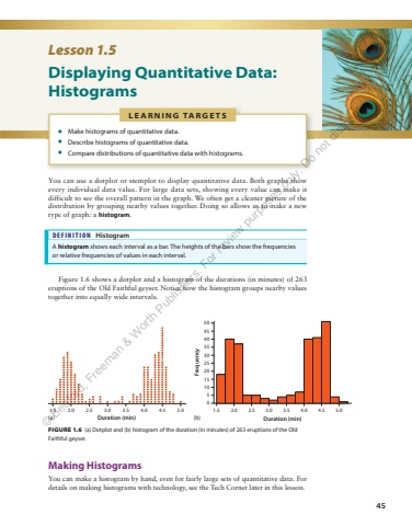
45L E A R N I N G TA R G E T S %u2022 Make histograms of quantitative data. %u2022 Describe histograms of quantitative data. %u2022 Compare distributions of quantitative data with histograms. Lesson 1.5 Displaying Quantitative Data: Histograms You can use a dotplot or stemplot to display quantitative data. Both graphs show every individual data value. For large data sets, showing every value can make it difficult to see the overall pattern in the graph. We often get a cleaner picture of the distribution by grouping nearby values together. Doing so allows us to make a new type of graph: a histogram. DEFINITION Histogram A histogram shows each interval as a bar. The heights of the bars show the frequencies or relative frequencies of values in each interval. Figure 1.6 shows a dotplot and a histogram of the durations (in minutes) of 263 eruptions of the Old Faithful geyser. Notice how the histogram groups nearby values together into equally wide intervals. FIGURE 1.6 (a) Dotplot and (b) histogram of the duration (in minutes) of 263 eruptions of the Old Faithful geyser. 1.5 2.0 2.5 3.0 3.5 4.0 4.5 5.0Duration (min)1.5051015202530354045502.0 2.5 3.0 3.5 4.0 4.5 5.0Duration (min)Frequency Making Histograms You can make a histogram by hand, even for fairly large sets of quantitative data. For details on making histograms with technology, see the Tech Corner later in this lesson. (a) (b)%u00a9 Bedford, Freeman & Worth Publishers. For review purposes only. Do not distribute.
