
Page 88 - Demo
P. 88
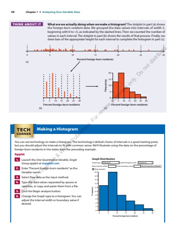
48 Chapter 1 %u2022 Analyzing One-Variable DataMaking a Histogram You can use technology to make a histogram. The technology%u2019s default choice of intervals is a good starting point, but you should adjust the intervals to fit with common sense. We%u2019ll illustrate using the data on the percentage of foreign-born residents in the states from the preceding example. Applet 1. Launch the One Quantitative Variable, Single Group applet at stapplet.com . 2. Enter %u201cPercent foreign-born residents%u201d as the Variable name. 3. Select Raw data as the input method. 4. Type the data values separated by spaces or commas, or copy-and-paste them from a file. 5. Click the Begin analysis button. 6. Change the Graph type to a histogram. You can adjust the interval width or boundary value if desired. Graph DistributionGraph type: Histogram Label histogram with: FrequencyEnter interval width: Enter boundary value:Show boxplot81012141618206420FrequencyPercent foreign-born residents0 5 10 15 20 25 30Reset intervals to default TECHCORNER What are we actually doing when we make a histogram? The dotplot in part (a) shows the foreign-born resident data. We grouped the data values into intervals of width 5, beginning with 0 to <5, as indicated by the dashed lines. Then we counted the number of values in each interval. The dotplot in part (b) shows the results of that process. Finally, we drew bars of the appropriate height for each interval to complete the histogram in part (c). THINK ABOUT IT (a)(b) (c)0 5 10 15 20 25 30Percent foreign-born residentsPercent foreign-born residents0 5 10 15 20 25 3020151050FrequencyPercent foreign-born residents0 5 10 15 20 25 30%u00a9 Bedford, Freeman & Worth Publishers. For review purposes only. Do not distribute.
