
Page 123 - Demo
P. 123
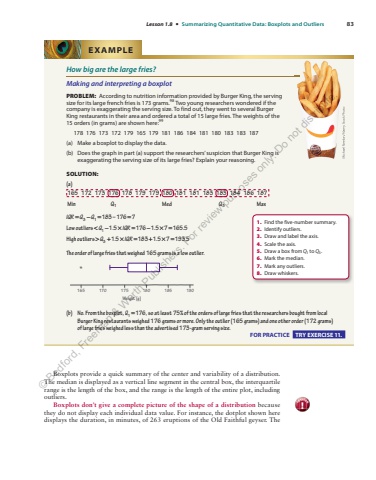
Lesson 1.8 %u2022 Summarizing Quantitative Data: Boxplots and Outliers 83How big are the large fries? Making and interpreting a boxplot PROBLEM: According to nutrition information provided by Burger King, the serving size for its large french fries is 173 grams. 98 Two young researchers wondered if the company is exaggerating the serving size. To find out, they went to several Burger King restaurants in their area and ordered a total of 15 large fries. The weights of the 15 orders (in grams) are shown here: 99 178 176 173 172 179 165 179 181 186 184 181 180 183 183 187 (a) Make a boxplot to display the data. (b) Does the graph in part (a) support the researchers%u2019 suspicion that Burger King is exaggerating the serving size of its large fries? Explain your reasoning. SOLUTION: (a) 165 172 173 176 178 179 179 180 181 181 183 183 184 186 187 Min Q1 Med Q3 Max IQR Q = %u22123 1 = Q = 183%u2013176 =7Low outliers < %u2212 Q I 1 %u2212 %u00d7 1.5 176 1. %u00d7 = QR %u2212 %u00d75 7 =165.5 High outliers > + Q I 3 + %u00d7 1.5 183 1. %u00d7 = QR + %u00d75 7 =193.5 The order of large fries that weighed 165 grams is a low outlier. 165 170*175 180 185 190Weight (g)(b) No. From the boxplot, Q1 =176 , so at least 75% of the orders of large fries that the researchers bought from local Burger King restaurants weighed 176 grams or more. Only the outlier (165 grams) and one other order (172 grams) of%u00a0large fries weighed less than the advertised 173-gram serving size. EXAMPLE Michael Neelon/Alamy Stock Photo1. Find the five-number summary. 2. Identify outliers. 3. Draw and label the axis. 4. Scale the axis. 5. Draw a box from Q1 to Q3 . 6. Mark the median. 7. Mark any outliers. 8. Draw whiskers. FOR PRACTICE TRY EXERCISE 11. Boxplots provide a quick summary of the center and variability of a distribution. The median is displayed as a vertical line segment in the central box, the interquartile range is the length of the box, and the range is the length of the entire plot, including outliers. Boxplots don%u2019t give a complete picture of the shape of a distribution because they do not display each individual data value. For instance, the dotplot shown here displays the duration, in minutes, of 263 eruptions of the Old Faithful geyser. The caution!%u00a9 Bedford, Freeman & Worth Publishers. For review purposes only. Do not distribute.
