
Page 124 - Demo
P. 124
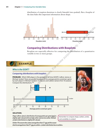
84 Chapter 1 %u2022 Analyzing One-Variable Datadistribution of eruption durations is clearly bimodal (two-peaked). But a boxplot of the data hides this important information about shape. Comparing Distributions with Boxplots Boxplots are especially effective for comparing the distribution of a quantitative variable in two or more groups. 1.5 2.0 2.5 3.0 3.5 4.0 4.5 5.0Duration (min) Duration (min)1.5 2.0 2.5 3.0 3.5 4.0 4.5 5.0Who is the GOAT? Comparing distributions with boxplots PROBLEM: Which NBA player is the greatest of all time (GOAT): LeBron James or Michael Jordan? Here are parallel boxplots of the average points scored per game by each player in Michael Jordan%u2019s 15 seasons and LeBron James%u2019s first 16 seasons. Compare the distributions. 100 Average points scored per game20 22 24 26 28 30 32 34 36JamesJordanSOLUTION: Shape: LeBron James%u2019s distribution of average points per game (ppg) is slightly right-skewed with one high outlier and one low outlier. Michael Jordan%u2019s distribution is slightly left-skewed. Outliers: The season when James averaged less than 21 ppg and the season when he averaged more than 31 ppg are outliers. Jordan%u2019s distribution has no outliers. EXAMPLE Mitchell Layton/Getty Images Remember to compare shape, outliers, center, and variability in context! %u00a9 Bedford, Freeman & Worth Publishers. For review purposes only. Do not distribute.
