
Page 125 - Demo
P. 125
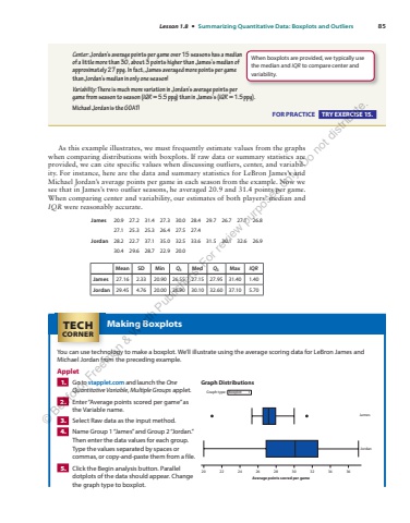
Lesson 1.8 %u2022 Summarizing Quantitative Data: Boxplots and Outliers 85 As this example illustrates, we must frequently estimate values from the graphs when comparing distributions with boxplots. If raw data or summary statistics are provided, we can cite specific values when discussing outliers, center, and variability. For instance, here are the data and summary statistics for LeBron James%u2019s and Michael Jordan%u2019s average points per game in each season from the example. Now we see that in James%u2019s two outlier seasons, he averaged 20.9 and 31.4 points per game. When comparing center and variability, our estimates of both players%u2019 median and IQR were reasonably accurate. James 20.9 27.2 31.4 27.3 30.0 28.4 29.7 26.7 27.1 26.8 27.1 25.3 25.3 26.4 27.5 27.4 Jordan 28.2 22.7 37.1 35.0 32.5 33.6 31.5 30.1 32.6 26.9 30.4 29.6 28.7 22.9 20.0 Mean SD Min Q1 Med Q3 Max IQRJames 27.16 2.33 20.90 26.55 27.15 27.95 31.40 1.40 Jordan 29.45 4.76 20.00 26.90 30.10 32.60 37.10 5.70 Center: Jordan%u2019s average points per game over 15 seasons has a median of a little more than 30, about 3 points higher than James%u2019s median of approximately 27 ppg. In fact, James averaged more points per game than Jordan%u2019s median in only one season! Variability: There is much more variation in Jordan%u2019s average points per game from season to season ( IQR %u2248 5.5ppg ) than in James%u2019s ( IQR %u22481.5ppg). Michael Jordan is the GOAT! FOR PRACTICE TRY EXERCISE 15. When boxplots are provided, we typically use the median and IQR to compare center and variability. Making Boxplots You can use technology to make a boxplot. We%u2019ll illustrate using the average scoring data for LeBron James and Michael Jordan from the preceding example. Applet 1. Go to stapplet.com and launch the One Quantitative Variable , Multiple Groups applet. 2. Enter %u201cAverage points scored per game%u201d as the Variable name. 3. Select Raw data as the input method. 4. Name Group 1 %u201cJames%u201d and Group 2 %u201cJordan.%u201d Then enter the data values for each group. Type the values separated by spaces or commas, or copy-and-paste them from a file. 5. Click the Begin analysis button. Parallel dotplots of the data should appear. Change the graph type to boxplot. Average points scored per gameGraph Distributions20 22 24 26 28 30 32 34 36JamesJordanGraph type: Boxplot TECHCORNER %u00a9 Bedford, Freeman & Worth Publishers. For review purposes only. Do not distribute.
