
Page 56 - Demo
P. 56
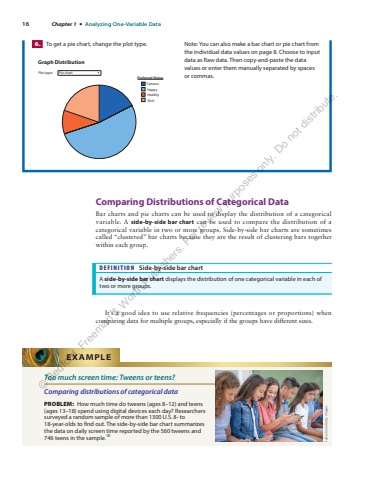
16 Chapter 1 %u2022 Analyzing One-Variable DataComparing Distributions of Categorical DataBar charts and pie charts can be used to display the distribution of a categorical variable. A side-by-side bar chart can be used to compare the distribution of a categorical variable in two or more groups. Side-by-side bar charts are sometimescalled %u201cclustered%u201d bar charts because they are the result of clustering bars together within each group.DEFINITION Side-by-side bar chartA side-by-side bar chart displays the distribution of one categorical variable in each of two or more groups.It%u2019s a good idea to use relative frequencies (percentages or proportions) when comparing data for multiple groups, especially if the groups have different sizes.6. To get a pie chart, change the plot type.Preferred StatusGraph DistributionPlot type: Pie chartRichHealthyFamousHappyNote: You can also make a bar chart or pie chart from the individual data values on page 8. Choose to input data as Raw data. Then copy-and-paste the data values or enter them manually separated by spaces or%u00a0commas.Too much screen time: Tweens or teens?Comparing distributions of categorical dataPROBLEM: How much time do tweens (ages 8%u201312) and teens (ages 13%u201318) spend using digital devices each day? Researchers surveyed a random sample of more than 1300 U.S. 8- to 18-year-olds to find out. The side-by-side bar chart summarizes the data on daily screen time reported by the 560 tweens and 746 teens in the sample.10EXAMPLEFatCamera/Getty Images%u00a9 Bedford, Freeman & Worth Publishers. For review purposes only. Do not distribute.
