
Page 58 - Demo
P. 58
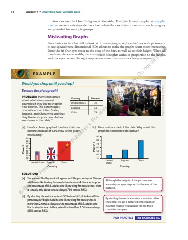
18 Chapter 1 %u2022 Analyzing One-Variable Data You can use the One Categorical Variable, Multiple Groups applet at stapplet.com to make a side-by-side bar chart when the raw data or counts in each category are provided for multiple groups. Misleading Graphs Bar charts can be a bit dull to look at. It is tempting to replace the bars with pictures or to use special three-dimensional (3D) effects to make the graphs seem more interesting. Don%u2019t do it! Our eyes react to the area of the bars as well as to their height. When all bars have the same width, the area (width %u00d7 height) varies in proportion to the height, and our eyes receive the right impression about the quantities being compared. Would you shop until you drop? Beware the pictograph! PROBLEM: Harris Interactive asked adults from several countries if they like to shop for new clothes. The percentages of adults in the United States, England, and China who said that they like to shop for new clothes are shown in the table. 11 (a) Here%u2019s a clever graph of the data that uses pictures instead of bars. How is this graph misleading? United StatesPercent0102030405060708090England ChinaCountry (b) Here is a bar chart of the data. Why could this graph be considered deceptive? UnitedStatesPercent30405060708090England ChinaCountrySOLUTION: (a) The areas of the flags make it appear as if the percentage of Chinese adults who like to shop for new clothes is about 4 times as large as the percentage of U.S. adults who like to shop for new clothes, when it is really only about twice as large (79% versus 39%). (b) By starting the vertical scale at 30 instead of 0, it looks as if the percentage of English adults who like to shop for new clothes is more than 2 times as large as the percentage of U.S. adults who like to shop for new clothes, when it is less than 1.5 times as large (53% versus 39%).EXAMPLE Imaginechina Limited/Alamy Stock PhotoCountry Percent United States 39 England 53 China 79 Although the heights of the pictures are accurate, our eyes respond to the area of the pictures. By starting the vertical scale at a number other than zero, we get a distorted impression of how the relative frequencies for the three countries compare. FOR PRACTICE TRY EXERCISE 15. %u00a9 Bedford, Freeman & Worth Publishers. For review purposes only. Do not distribute.
