
Page 60 - Demo
P. 60
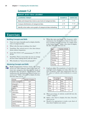
20 Chapter 1 %u2022 Analyzing One-Variable Data Lesson 1.2 W H AT D I D Y O U L E A R N ? LEARNING TARGET EXAMPLE EXERCISES Make and interpret bar charts or pie charts of categorical data. p. 14 7%u201310 Compare distributions of categorical data. p. 16 11%u201314 Identify what makes some graphs of categorical data misleading. p. 18 15%u201318 Building Concepts and Skills 1. Name two types of graphs used to display distributions of categorical data. 2. What is the first step in making a bar chart? 3. True/False: The vertical axis in a bar chart always shows relative frequencies. 4. A pie chart shows each as a slice of the pie. 5. True/False: There is more than one way to arrange the bars when making side-by-side bar charts. 6. Why should you %u201cbeware the pictograph%u201d? Mastering Concepts and Skills 7. Radio frequencies? Nielsen Audio, the rating service for radio audiences, places U.S. radio stations into categories that describe the kinds of programs they broadcast. The frequency table summarizes the distribution of station format in a recent year. 13 Make a bar chart to display the data. Describe what you see.Format Number of stations Adult contemporary 1357 All sports 669 Classic hits 1140 Country 2200 News/talk/information 2002 Oldies 405 Religious 3837 Rock 1466 Spanish language 1228 Variety 1257 Other formats 1769 8. What day were you born? The frequency table summarizes the distribution of data on the numbers of babies born on each day of a single week in the United States. 14 Make a bar chart to display the data. Describe what you see.Day Number of births Sunday 7374 Monday 11,704 Tuesday 13,169 Wednesday 13,038 Thursday 13,013 Friday 12,664 Saturday 8459 9. Cool car colors The popularity of colors for cars and light trucks changes over time. Here is a relative frequency table that summarizes data on the colors of vehicles sold worldwide in a recent year. 15 Color Percentage of vehicles Color Percentage of vehicles Black 21 Red 5 Blue 8 Silver 8 Brown 2 White 34 Gray 19 Yellow 1 Green 1 Other ?? (a) What percentage of vehicles would fall into the %u201cOther%u201d category? (b) Make a bar chart to display the data. Describe what you see. (c) Would it be appropriate to make a pie chart of these data? Explain your answer. pg 14 Exercises %u00a9 Bedford, Freeman & Worth Publishers. For review purposes only. Do not distribute.
