
Page 53 - Demo
P. 53
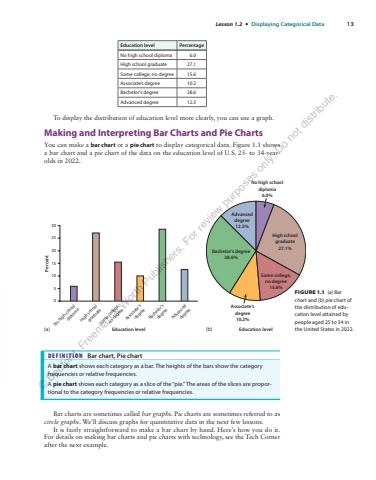
Lesson 1.2 %u2022 Displaying Categorical Data 13Education level PercentageNo high school diploma 6.0High school graduate 27.1Some college, no degree 15.6Associate%u2019s degree 10.2Bachelor%u2019s degree 28.6Advanced degree 12.5To display the distribution of education level more clearly, you can use a graph.Making and Interpreting Bar Charts and Pie ChartsYou can make a bar chart or a pie chart to display categorical data. Figure 1.1 shows a bar chart and a pie chart of the data on the education level of U.S. 25- to 34-yearolds in 2022.DEFINITION Bar chart, Pie chartA bar chart shows each category as a bar. The heights of the bars show the category frequencies or relative frequencies.A pie chart shows each category as a slice of the %u201cpie.%u201d The areas of the slices are proportional to the category frequencies or relative frequencies.Bar charts are sometimes called bar graphs. Pie charts are sometimes referred to as circle graphs. We%u2019ll discuss graphs for quantitative data in the next few lessons.It is fairly straightforward to make a bar chart by hand. Here%u2019s how you do it. For details on making bar charts and pie charts with technology, see the Tech Corner after the next example.(a)No high schooldiploma6.0%Associate%u2019sdegree10.2%High schoolgraduate27.1%Some college,no degree15.6%Bachelor%u2019s degree28.6%Advanceddegree12.5%(b) Education level051015202530Education levelPercentNo high schooldiplomaHigh schoolgraduateSome college,no degreeAssociate%u2019sdegreeBachelor%u2019sdegreeAdvanceddegreeFIGURE 1.1 (a) Bar chart and (b) pie chart of the distribution of education level attained by people aged 25 to 34 in the United States in 2022.%u00a9 Bedford, Freeman & Worth Publishers. For review purposes only. Do not distribute.
