
Page 54 - Demo
P. 54
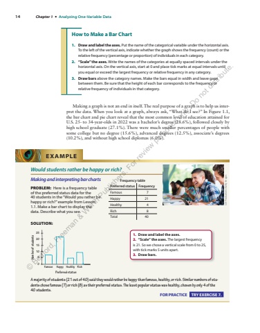
14 Chapter 1 %u2022 Analyzing One-Variable Data Making a graph is not an end in itself. The real purpose of a graph is to help us interpret the data. When you look at a graph, always ask, %u201cWhat do I see?%u201d In%u00a0 Figure%u00a01.1 , the bar chart and pie chart reveal that the most common level of education attained for U.S. 25- to 34-year-olds in 2022 was a bachelor%u2019s degree (28.6%), followed closely by high school graduate (27.1%). There were much smaller percentages of people with some college but no degree (15.6%), advanced degrees (12.5%), associate%u2019s degrees (10.2%), and without high school diplomas (6.0%). How to Make a Bar Chart 1. Draw and label the axes. Put the name of the categorical variable under the horizontal axis. To the left of the vertical axis, indicate whether the graph shows the frequency (count) or the relative frequency (percentage or proportion) of individuals in each category. 2. %u201cScale%u201d the axes. Write the names of the categories at equally spaced intervals under the horizontal axis. On the vertical axis, start at 0 and place tick marks at equal intervals until you equal or exceed the largest frequency or relative frequency in any category. 3. Draw bars above the category names. Make the bars equal in width and leave gaps between them. Be sure that the height of each bar corresponds to the frequency or relative frequency of individuals in that category. Would students rather be happy or rich? Making and interpreting bar charts PROBLEM: Here is a frequency table of the preferred status data for the 40%u00a0students in the %u201cWould you rather be happy or rich?%u201d example from Lesson 1.1. Make a bar chart to display the data. Describe what you see. SOLUTION: Preferred statusFamous0510152025Happy Healthy RichNumber of students A majority of students (21 out of 40) said they would rather be happy than famous, healthy, or rich. Similar numbers of students chose famous (7) or rich (8) as their preferred status. The least popular status was healthy, chosen by only 4 of the 40 students. FOR PRACTICE TRY EXERCISE 7. EXAMPLE SDI Productions/Getty ImagesFrequency table Preferred status Frequency Famous 7 Happy 21 Healthy 4 Rich 8 Total 40 1. Draw and label the axes. 2. %u201cScale%u201d the axes. The largest frequency is%u00a021. So we chose a vertical scale from 0 to 25, with tick marks 5 units apart. 3. Draw bars.%u00a9 Bedford, Freeman & Worth Publishers. For review purposes only. Do not distribute.
