
Page 61 - Demo
P. 61
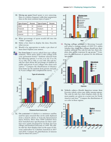
Lesson 1.2 %u2022 Displaying Categorical Data 2110. Slicing up spam Email spam is very annoying. Here is a relative frequency table that summarizes data on the most common types of spam. 16 Type of spam Percent Type of spam Percent Adult 19 Leisure 6 Financial 20 Products 25 Health 7 Scams 9 Internet 7 Other ?? (a) What percentage of spam would fall into the %u201cOther%u201d category? (b) Make a bar chart to display the data. Describe what you see. (c) Would it be appropriate to make a pie chart of these data? Explain your answer. 11. Far from home A survey asked first-year college students, %u201cHow many miles is this college from your permanent home?%u201d Students selected from the following options: 5 or less, 6 to 10, 11 to 50, 51 to 100, 101 to 500, or over 500. The side-byside bar chart shows the percentage of students at public and private 4-year colleges who chose each option. 17 Compare the distributions of distance from home for the students from private and public 4-year colleges who completed the survey. Distance from home (mi)Type of universityPercent3035 Private Public25201510505 or less6 to 1011 to 5051 to 100101 to 500Over 5005 or less6 to 1011 to 5051 to 100101 to 500Over 50012. On a mission! A CubeSat is a miniature satellite used for space research that can be easily deployed from a launch vehicle or from the International Space Station. More than 1000 CubeSats have been launched since specifications for these satellites were jointly developed by Cal Poly San Luis Obispo and Stanford University in 1999. The sideby-side bar chart displays data on the types of missions undertaken by CubeSats launched in 2017 and 2019. Compare the distributions of mission type for these two years. 18 01020304050602017 2019YearPercentBallastCommunicationsImagingMilitaryEducationMission typeScienceTechnology13. Paying college athletes A Morning Consult poll asked a random sample of 2205 U.S. adults whether they think that colleges should pay their student athletes. The side-by-side bar chart displays data on the responses by age group. 19 Compare the distributions of opinion for the different age groups. Yes No0102030405060Don%u2019t know/no opinionPercentOpinionAge group18%u20133435%u20134445%u20136465+14. Vehicle colors%u2014North America versus AsiaFavorite vehicle colors may differ among regions. The side-by-side bar chart displays data on the most popular car colors in a recent year for North America and Asia. 20 Compare the distributions of car color in these regions. PercentWhiteBlackSilverBlueGrayRedBrownGreenYellowOtherColorRegionNorth AmericaAsia0510152025303540pg 16%u00a9 Bedford, Freeman & Worth Publishers. For review purposes only. Do not distribute.
