
Page 64 - Demo
P. 64
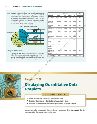
24 Chapter 1 %u2022 Analyzing One-Variable Data26. Cow pie chart? Methane is a greenhouse gas that may contribute to climate change. The modified pie chart shown here displays data on the sources of methane emissions in the United States. 25 Write a thorough analysis of what the graph shows. Be sure to include a comparison of methane emissions by beef cows, dairy cows, and pigs. Oil and gasproduction30%Landfills17%Coal mining8%Others10%Livestockproduction35%20%11%4% 89% 11%43% 57%2.6% BEEF 97.4%DAIRYThe U.S. methane breakdownPORKback end front endRecycle and Review 27. Skyscrapers (1.1) Here is some information about the tallest buildings in the world (completed by 2023). 26 Identify the individuals and variables in this data set. Classify each variable as categorical or quantitative.Building Country Height (m) Floors Use Year completed Burj Khalifa United Arab Emirates 828.0 163 Mixed 2010 Merdeka PNB 118 Malaysia 678.9 118 Mixed 2023 Shanghai Tower China 632.0 128 Mixed 2015 Abraj Al Bait Saudi Arabia 601.0 120 Hotel 2012 Ping An Finance Center China 599.1 115 Mixed 2017 Lotte World Tower South Korea 554.5 123 Mixed 2017 One World Trade Center United States 541.3 94 Office 2014 Tianjin CTF Finance Center China 530.4 97 Mixed 2019 Guangzhou CTF Finance Centre China 530.0 111 Mixed 2016 CITIC Tower China 527.7 101 Mixed 2019 Lesson 1.3 Displaying Quantitative Data: Dotplots You can use a bar chart or pie chart to display categorical data. A dotplot is the simplest graph for displaying quantitative data. L E A R N I N G TA R G E T S %u2022 Make and interpret dotplots of quantitative data. %u2022 Describe the shape of a distribution of quantitative data. %u2022 Describe or compare distributions of quantitative data with dotplots. %u00a9 Bedford, Freeman & Worth Publishers. For review purposes only. Do not distribute.
