
Page 68 - Demo
P. 68
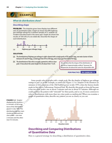
28 Chapter 1 %u2022 Analyzing One-Variable Data Some people refer to graphs with a single peak, like the dotplot of highway gas mileage ratings in part (a) of the example, as unimodal . Figure 1.3 is a dotplot of the duration (in minutes) of 263 eruptions of the Old Faithful geyser in July 1995, when the Starnes family made its first trip to Yellowstone National Park. We describe this graph as bimodal because it has two clear peaks: one at about 2 minutes and one at about 4.5 minutes. Although we could continue the pattern with %u201ctrimodal%u201d for three peaks, and so on, it%u2019s more common to refer to distributions with more than two clear peaks as multimodal . When you examine a graph of quantitative data, describe any pattern you see as clearly as you can. 1.5 2.0 2.5 3.0 3.5 4.0 4.5 5.0Duration (min) Describing and Comparing Distributions of%u00a0 Quantitative Data Here is a general strategy for describing a distribution of quantitative data. FIGURE 1.3 Dotplot displaying the duration, in minutes, of 263 eruptions of the Old Faithful geyser in July 1995. This distribution has two main clusters of data and two clear peaks%u2014one near 2 minutes and the other near 4.5 minutes. What do distributions show? Describing shape PROBLEM: The dotplots given here display two different sets of quantitative data. Graph (a) shows the EPA highway gas mileage ratings for a random sample of 21 midsize car models manufactured in the same year. Graph (b) shows the results of 100 rolls of a six-sided die. Describe the shape of each distribution. (a) Highway gas mileage (mpg)25 30 35 40 45 50 (b) 1234 5Roll6 SOLUTION: (a) The distribution of highway gas mileage is right-skewed with a single peak at 30 and 31 mpg, one main cluster of dots between 25 and 34 mpg, a small gap from 34 to 38 mpg, and a large gap from 40 to 50 mpg. (b) The distribution of die rolls is roughly symmetric with no clear peak. It has about the same height for all values from 1 to 6. EXAMPLE We can describe the shape of the distribution of die rolls as %u201capproximately uniform%u201d because the frequencies are about the same for all possible rolls. FOR PRACTICE TRY EXERCISE 11. %u00a9 Bedford, Freeman & Worth Publishers. For review purposes only. Do not distribute.
