
Page 66 - Demo
P. 66
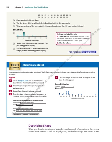
26 Chapter 1 %u2022 Analyzing One-Variable Data 25 30 27 31 38 26 28 40 25 28 30 31 30 30 34 30 31 31 32 50 31 (a) Make a dotplot of these data. (b) The dot above 38 is for a Honda Civic. Explain what this dot represents. (c) What percentage of the car models in the sample get more than 35 mpg on the highway? SOLUTION: (a) Highway gas mileage (mpg)25 30 35 40 45 50 (b) The dot above 38 indicates that the Honda Civic gets 38 mpg on the highway. (c) 3/21 0.143 = or 14.3% of the car models in the sample get more than 35 mpg on the highway. FOR PRACTICE TRY EXERCISE 7. 1. Draw and label the axis. 2. Scale the axis. The smallest value is 25 and the largest value is 50. So we chose a scale from 25 to 50 with tick marks 5 units apart. 3. Plot the values.Making a Dotplot You can use technology to make a dotplot. We%u2019ll illustrate using the highway gas mileage data from the preceding example. Applet 1. Go to stapplet.com and launch the One Quantitative Variable, Single Group applet. 2. Enter %u201cHighway gas mileage (mpg)%u201d as the Variable name. 3. Select Raw data as the input method. 4. Type the data values separated by spaces or commas, or copy-and-paste them from a%u00a0file. 5. Click the Begin analysis button. A dotplot of the data should appear. TECHCORNER Describing Shape When you describe the shape of a dotplot or other graph of quantitative data, focus on the main features. Look for major peaks, not for minor ups and downs in the Highway gas mileage (mpg)26 28 30 32 34 36 38 40 42 44 46 48 50Graph DistributionGraph type:Show boxplotDotplotOne Quantitative Variable, Single GroupBegin analysis Edit inputs Reset everythingVariable name:Input data separated by commas or spaces.Data: 25 30 27 31 38 26 28 40 25 28 30 31 30 30 3034Input:Highway gas mileage (mpg)Raw data%u00a9 Bedford, Freeman & Worth Publishers. For review purposes only. Do not distribute.
