
Page 69 - Demo
P. 69
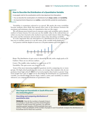
Lesson 1.3 %u2022 Displaying Quantitative Data: Dotplots 29How to Describe the Distribution of a Quantitative VariableIn any graph, look for the overall pattern and for clear departures from that pattern.%u2022 You can describe the overall pattern of a distribution by its shape, center, and variability.%u2022 An important kind of departure is an outlier, a value that falls outside the overall pattern.Variability is sometimes referred to as spread. We prefer the term variability because students often think that spread refers only to the distance between the maximum and minimum values of a quantitative data set (the range).We will discuss more formal ways to measure center and variability and to identify outliers in future lessons. For now, just use the middle value in the ordered data set (what you may have learned as the median in previous math classes) when describing the center and the minimum and maximum values when describing variability.It is also important that any description of a distribution be put in context. The best way to include context is to use the name of the variable being displayed.Let%u2019s practice with the dotplot of scores on a 20-point statistics quiz from Figure 1.2.Quiz score13 14 15 16 17 18 19 20Shape: The distribution of quiz scores is skewed to the left, with a single peak at 20.Outliers: There are no obvious outliers.Center: The middle value (median) is a quiz score of 19.Variability: The quiz scores vary from 13 to 20.Some of the most interesting statistical questions involve comparing two or more groups. Do high school graduates earn more, on average, than students who do not graduate from high school? Which of several popular diets leads to greater longterm weight loss? Just as when you%u2019re describing the distribution of a quantitative variable, you should always discuss shape, outliers, center, and variability in context whenever you compare distributions of quantitative data.How large are households in South Africa and the United Kingdom?Describing and comparing distributions of quantitative dataPROBLEM: How do the numbers of people living in households in South Africa and the United Kingdom compare? To help answer this question, we selected separate random samples of 50 households from each country.28 Here are dotplots of the number of people in each household. Compare the distributions of household size for these two%u00a0countries.EXAMPLEMieneke Andeweg-van Rijn/Getty Images%u00a9 Bedford, Freeman & Worth Publishers. For review purposes only. Do not distribute.
