
Page 71 - Demo
P. 71
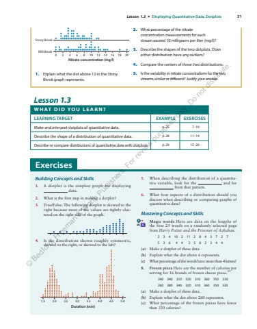
Lesson 1.3 %u2022 Displaying Quantitative Data: Dotplots 31 Lesson 1.3 W H AT D I D Y O U L E A R N ? LEARNING TARGET EXAMPLE EXERCISES Make and interpret dotplots of quantitative data. p. 25 7%u201310 Describe the shape of a distribution of quantitative data. p. 28 11%u201314 Describe or compare distributions of quantitative data with dotplots. p. 29 15%u201320 Stony BrookMill Brook0246 8 10 12 14 16 18 20Nitrate concentration (mg/l) 1. Explain what the dot above 12 in the Stony Brook graph represents. 2. What percentage of the nitrate concentration measurements for each stream exceed 10 milligrams per liter (mg/l)? 3. Describe the shapes of the two dotplots. Does either distribution have any outliers? 4. Compare the centers of these two distributions. 5. Is the variability in nitrate concentrations for the two streams similar or different? Justify your answer. Building Concepts and Skills 1. A dotplot is the simplest graph for displaying data. 2. What is the first step in making a dotplot? 3. True/False: The following dotplot is skewed to the right because most of the values are tightly clustered on the right side of the graph. 4. Is the distribution shown roughly symmetric, skewed to the right, or skewed to the left? 1.5 2.0 2.5 3.0 3.5 4.0 4.5 5.0Duration (min) 5. When describing the distribution of a quantitative variable, look for the and for from that pattern. 6. What four aspects of a distribution should you discuss when describing or comparing graphs of quantitative data? Mastering Concepts and Skills 7. Magic words Here are data on the lengths of the%u00a0first 25 words on a randomly selected page from Harry Potter and the Prisoner of Azkaban. 2 3 4 10 2 11 2 8 4 3 7 2 7 5 3 6 4 4 2 5 8 2 3 4 4 (a) Make a dotplot of these data. (b) Explain what the dot above 6 represents. (c) What percentage of the words have more than 4%u00a0letters? 8. Frozen pizza Here are the number of calories per serving for 16 brands of frozen cheese pizza. 29 340 340 310 320 310 360 350 330 260 380 340 320 310 360 350 330 (a) Make a dotplot of these data. (b) Explain what the dot above 260 represents. (c) What percentage of the frozen pizzas have fewer than 330 calories? pg 25 Exercises %u00a9 Bedford, Freeman & Worth Publishers. For review purposes only. Do not distribute.
